Fotomoto gives you full control over which images you sell on your site, and how the Buy Button links will look.
Note: if you're using Fotomoto with services like PhotoFolio, jAlbum, Crevado, Pixpa or FolioHD, their code may control the appearance of the Buy Buttons, so please consult their documentation about whether it's possible to change the appearance of the Buy Buttons.

How to change which images are for sale (turn Buy Buttons on/off)
If you have "For Sale" set as your default Collection, Fotomoto will put Buy Buttons under every image where the width or height is larger than the value set as the "Minimum Width or Height for Images".
Of course there will be some images that you don't want to sell, so you have a few options:
How to change the Buy Button link text
To change what the links say (the text):
- Go to the Store Appearance page in your Dashboard
- Roll your cursor over the Buy Buttons that appear in the Preview, and click the "Change Label" button that pops up.
- Enter the desired text and click OK.
Putting the Buy Buttons above the image instead of below
By default, the Buy Buttons will appear under your images. You can easily put the Buy Buttons above the image by changing the Position setting in the Site > Settings > Toolbar section of the Fotomoto Dashboard.
Note that this option may not work with certain lightbox-style galleries.
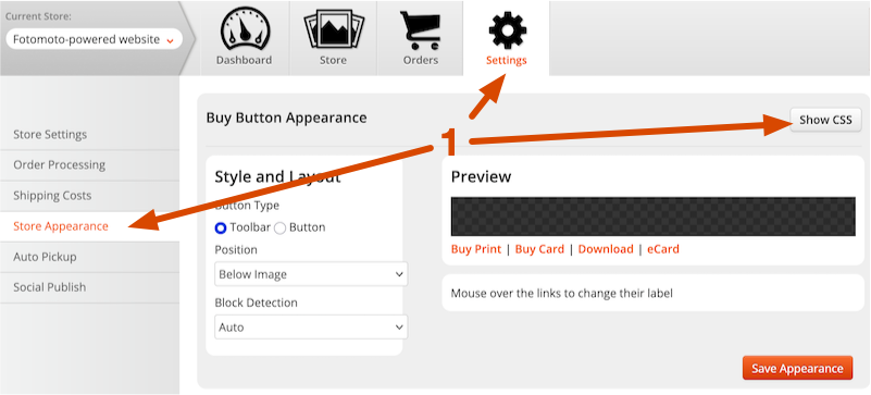
Changing the appearance & position of the Buy Buttons
You can change the look of the Buy Buttons to match your site using Cascading Style Sheets (CSS). You can change fonts, colors, position, hide links and much more.
Important: You'll want to know a bit about CSS to do this correctly, as we can't always offer CSS programming support. We've posted a few Buy Button customization examples to get you started. If you need a hand, contact our support team, otherwise we recommend you seek the assistance of a web designer or other CSS expert if you need further assistance.
We recommend that you add any custom Buy Button CSS to your Fotomoto Dashboard:
- Click Settings, then Store Appearance to navigate to the Store Appearance page in your Dashboard, and click the "Show CSS" button under Buy Button Appearance.
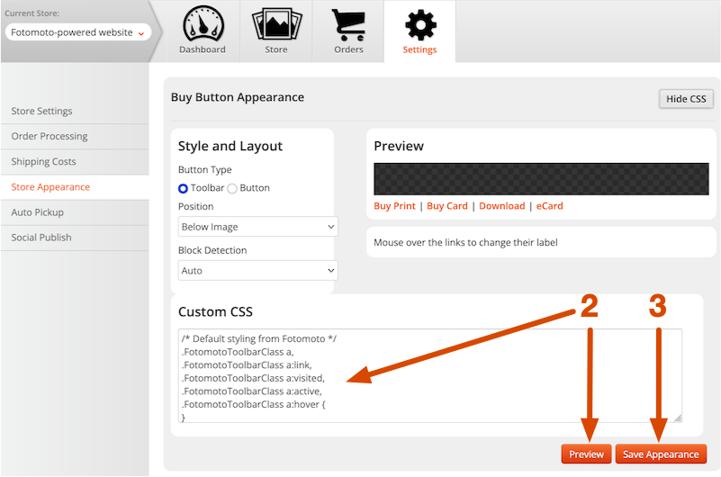
Note: there is no way to restore the default CSS once changed, so you may wish to copy it and save it in a safe location, or you can contact our Support Team and ask to restore the default CSS. - Edit the default buy button CSS or add rules for the Buy Button elements, then click the Preview button to see how your Buy Buttons will look in the Preview section.
- Click the Save Appearance button to save your changes.
Buy Button HTML/CSS
For reference, here is an explanation of the HTML and CSS that controls the Buy Buttons.
The Buy Buttons are contained in a DIV with the class "FotomotoToolbarClass". Buy Button links are anchors within unordered list items. The separators that go between the links are enclosed in spans within unordered list items. All of these elements have their own class attribute so you can change them individually or all at once.
Here is a simplified view of the HTML structure and classes that control presentation. Note we have removed some of the code for readability.
<div class="FotomotoToolbarClass">

	 <ul class="FotomotoBar">
	  <li class="FotomotoPrintButton">
	   <a class="FotomotoBarLink">Buy Print</a>
	   </li>

	  <li class="FotomotoSeparator">
	   <span class="FotomotoSep1"></span>
	   </li>

	  <li class="FotomotoCardButton">
	   <a class="FotomotoBarLink">Buy Card</a>
	   </li>

	  <li class="FotomotoSeparator">
	   <span class="FotomotoSep2"></span>
	   </li>

	  <li class="FotomotoLicenseButton">
	   <a class="FotomotoBarLink">Download</a>
	   </li>

	  <li class="FotomotoSeparator">
	   <span class="FotomotoSep3"></span>
	   </li>

	  <li class="FotomotoShareButton">
	   <a class="FotomotoBarLink">Share</a>
	   </li>

	  <li class="FotomotoSeparator FotomotoShareSeparator">
	   <span class="FotomotoSep4"></span>
	   </li>

	  <li class="FotomotoECardButton">
	   <a class="FotomotoBarLink">Send eCard</a>
	   </li>

	 </ul>
	</div>
Here's an example - say we want to change the color of the anchor within the print button class to red:
.FotomotoPrintButton a {color: red !important;}
Here's another example showing how you can move the Buy Buttons down a bit (by 8 pixels)
.FotomotoToolbarClass { margin-top: 8px !important; /* move 8 pixels down */ }
Note that you may need to use the "!important" declaration to override the normal declaration.
Want more examples? You can find a few "official" examples in our Buy Button customization examples article.
A note about customization support
We receive a lot of requests for help with code because 3rd party CSS can make our Buy Buttons appear to be "broken". We don't officially provide support for 3rd party CSS, but let us know if we can help by taking a look at Buy Buttons that don't appear as they should.
Advanced customization
For our users familiar with JavaScript, if you want more control over when and where the Buy Buttons appear, how they get "checked in" to your Fotomoto Dashboard and more, you can design your own Buy Buttons and use our API functions to cause them to open the shopping cart Widget - please see Getting Started with the Fotomoto API.
